
Navigation & widgets
How to structure your web app with the left navigation drawer and right-side widgets.
Your web app is built around one simple idea: a central feed of content, framed by navigation on the left and context on the right. This guide explains how those two sides work, and how to arrange them so people find what they need without thinking about it.
The basic layout
The center of the app is your news feed - the home screen everyone lands on. It behaves like a front page: the stream of content you want people to see first.
From there, tabs let people jump to other feeds with a single tap. You can place tabs on top of the news feed (see 2 below, they become sliders in the mobile apps!). Or as sticky navigation on the left side (see 1).
A tab can lead to a topic, a department, a project, or an event stream — any feed you define. This same tab structure carries straight into your iOS and Android apps, so what you set up once works everywhere.
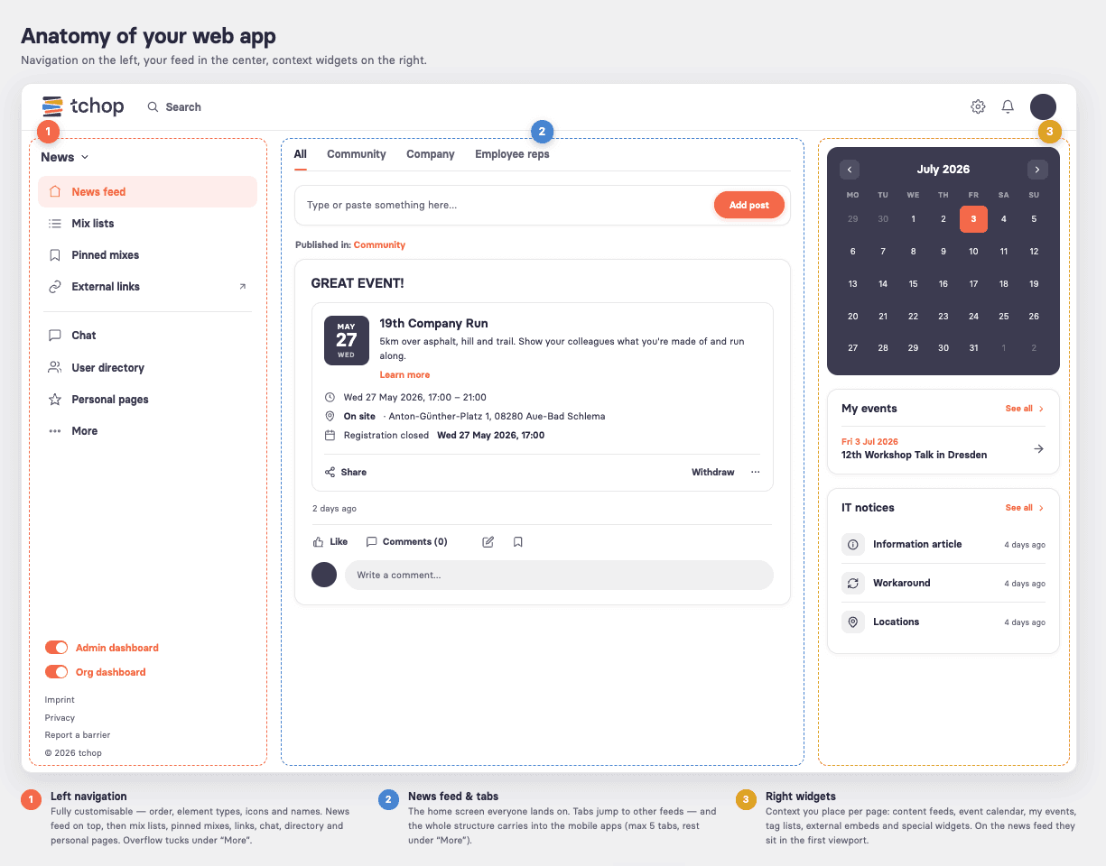
The left navigation
The left navigation drawer is fully customizable. You control the order of entries, the type of each element, the icon, and the name. Nothing is fixed - you build the menu that fits your audience. You can adjust and extend it on the go.
A structure that works well for most apps, top to bottom:
News feed - at the top, acting as the home page. The first thing people see when they open the app.
Mix lists - like a section index. They give an overview of what’s available and let people dive into individual feeds.
Pinned mixes - standalone feeds you promote to the menu. A pinned mix can hold any type of content or feed you want to highlight.
External links - direct links, or overview lists of links, to other sources and systems your people use.
Chat - if you want to use it.
User directory - if you want to make it available.
Personal pages - the individual’s own space: profile, their content, their bookmarks.
When the list gets long, you don’t have to show everything at once. Entries can be tucked behind a “More” item, so the menu stays clean and the most important destinations stay visible.
How this looks on mobile
The left navigation you build for the web app carries over into the mobile apps automatically. The one difference: mobile shows a maximum of five tabs in the bottom bar. Anything beyond the first five moves into a “More” sub-menu — so order matters. Put your five most important destinations first.
However you can have feeds and navigation that you only have in the web app, that you don't want in the mobile apps (and the other way around), which gives you full freedom to adjust each channel to your needs.
The right widgets
Where the left side is about navigation, the right side is about context. Widgets (see 3 above) sit alongside the main content and can be configured per page — the news feed gets one set, each mix or section feed can get another.
On the news feed, right-side widgets appear in the first viewport — the most prominent position in the whole app. Use it for what matters most.
On other mix lists, section lists, or feeds, widgets add supporting context relevant to that specific page.
Types of widgets
Link to a specific post — send people straight to one important card.
Content feed — a stream pulled from any mix. You can even let users choose which feed they want to see in the widget.
Event calendar — upcoming events at a glance.
My events — the events an individual has joined or is attending.
Tag list — a set of tags people can use to filter or explore.
External embed — embed an external link or a link into another system.
Special widgets — widgets that display custom logic for more advanced needs.
Putting it together
Think of it as three columns working together: navigate on the left, read in the center, get context on the right. Start with a clean left menu - news feed on top, your five key destinations first for mobile - then use right-side widgets to surface what each page needs most.